Save Rolling Star from Its Own Cover Art!
January next year, YUI will release her new single, "Rolling Star". All is well in the YUI fandom, the song rocks and everything. But underneath all that, many of us are suffering. The reason? This piece of disaster from Sony, the supposed cover art for said single.
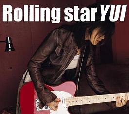
Oh! Mi eyes!
Now, let's bring rationale back to work. We know it's ugly, but why exactly? Let's find out what this picture is trying to convey (and see why it fails so miserably at that).
First, the picture of YUI on the cover. Generally, YUI's image is a simple, lovable, care-free acoustic guitar-carrying singer-songwriter. The YUI you see here is different: leather jacket, electric guitar, rocking pose. To me, this is kind of an expansion to YUI's image in LIFE, one of her previous (and famous) single (although YUI used an acoustic guitar in LIFE).
This contrast is probably inevitable, though, because Rolling Star itself is a rock song (which is something rare in YUI's work). Therefore, we can conclude that the picture is trying to say: this is a Rock song. Which works, kind of.
Now let's go to our second point: Typography. This is where everything starts to go downhill.
To be fair, the text is readable (although a bit too distracting because of its size). It is easy to tell the difference between the title and the artist name. But the typeface selection is horrible! It does nothing to support the rock image, because the only thing it says is 'plain'. Now, if this is the cover art for a more laid-back, acoustic-based song that YUI used to create, the typeface would meet a warmer welcome. But not on Rolling Star.
Typography matters. A lot. And the lack of attention to it is what I think kills the cover. Maybe Sony had their own logic behind this. Maybe the plainness of the text is their way to say,
"Hey, all YUI fans! Never worry! Maybe YUI had a change of image and style in this song (like you see on her pic), but she's still the simple YUI that you all adore. Really! Just look at the cover-text!"
But so yeah, Sony should just eat their contrasting rationale. To me, this cover screams "MS Paint." It just doesn't work.
And so, armed with old, trusty Photoshop 6, a copy of Rolling Star PV and BS Player, I'm ready to roll. My mission is simple: Give Rolling Star the pride it deserves.
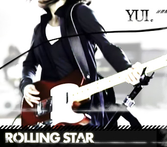
Damn straight rock'n.
<3, Hafiz.
Comments & Discussion

I don't know why but I like the original one. Yours is good, way too good if I can say. But the original one is oldskool. And I can't say I dislike it.
Perhaps the producer just think the same with you. But finally, a lot of people decide to buy it, discuss about those stupid cover, like you. Just because its cover... Then trying to listen to her music. And again, like her so much more, like you and I. haha..(stupid comment) ;p.

hmm actually I understand the goal behind the original one. oldskoolness is right on the spot, but the font is terrible. Really. there are better oldskool fonts out there. :D
but yeah, we like YUI so much.
 back to top
ARCHIVES

